
10 Ways to Instantly Improve Your Church Website
Building a church website that looks like everything you hoped it would can take some serious work. Whether your church needs a brand new website or a quick facelift, I’ll show you a few design tricks to instantly improve your church’s online presence! A simple playbook to communicate your story better and connect with your audience?
As a designer, I’m constantly exploring new trends and best practices to help take my client’s website to the next level. Today, I’m going to teach you how to apply 10 simple design strategies to instantly improve your church website.
1. Give every page a purpose.
Church websites have a lot of moving pieces. There’s service information, sermons, events, about content, and ministry groups. While some pages will combine a few different topics, it’s best to plan one clear purpose per page.
Crossroads Community Church has a clear and focused homepage. It’s all about inviting visitors to come check out a service. The image, headline, and button all rally behind that one purpose.

Crossroads Community Church Homepage.
2. Provide clear navigation links.
Visitors won’t always know the right terminology that your church community is use to so make sure your navigation uses naming conventions that anyone can understand. Keep each link simple and clearly labeled to tell your visitor where they will land.
The Father’s House uses straight forward navigation links to eliminate any potential confusion for their visitors.
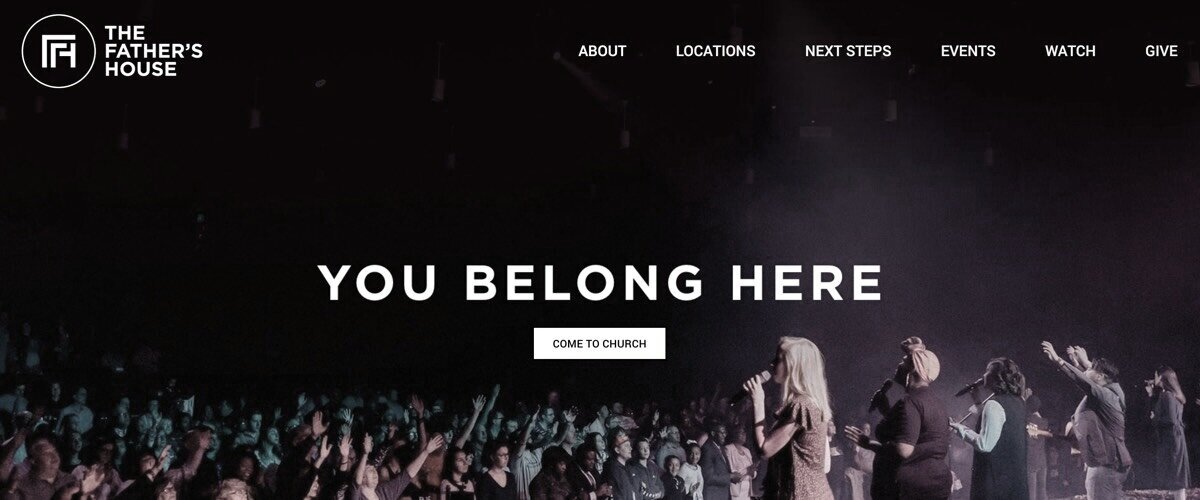
The Father’s House Simple Navigation.
3. Guide visitors to a logical next step.
Creating a great website experience means thinking through your users complete journey. The goal is to learn what people are looking for and quickly getting them to the finish line.
The Father’s House makes taking the next step as easy as possible with a grid of colorful buttons placed directly on the homepage. They continue the same experience throughout all their pages making sure next steps are logical and organic.
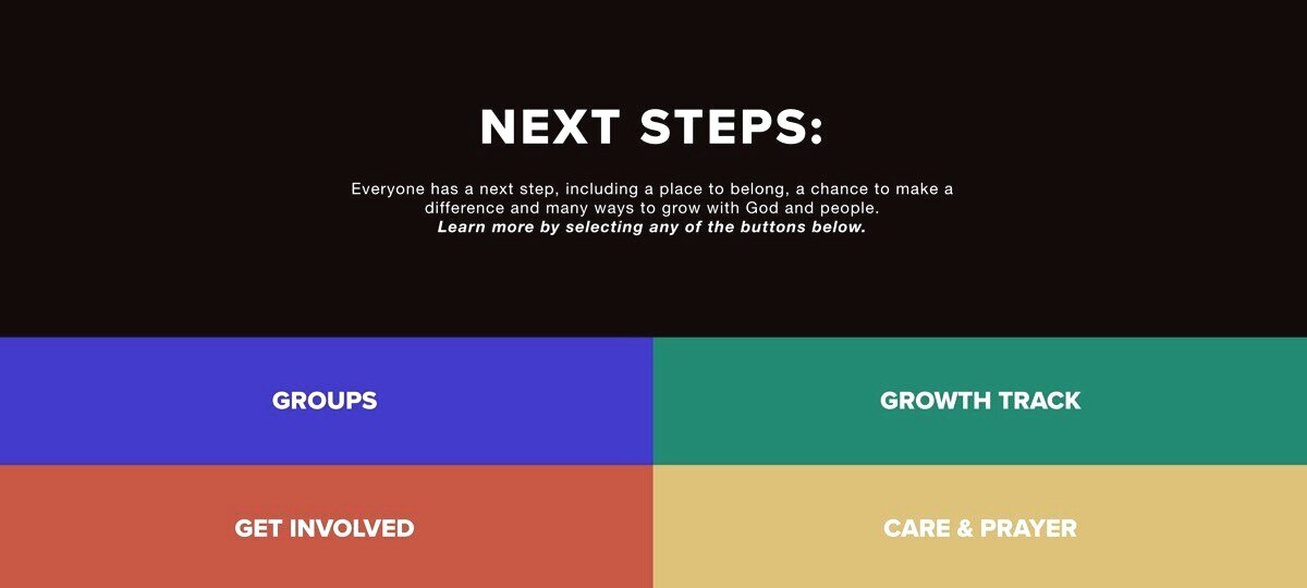
The Father’s House Homepage.

The Father’s House Groups Page.
4. Write like you speak.
I don’t know too many church leaders who struggle with conversation! But most of us lock up and think we have to switch gears when we write content for our website. Instead, picture someone specific and write like they are the only one in the room. It’s a fun trick to get over the block!
Hill City RVA uses humor and conversational language to tell first-time guest what they can expect. Their first sentence breaks the ice, “Our dress code is black tie optional. Just kidding.” Brilliant :)

Hill City Church What to Expect Page.
The Meeting House “Loneliness Sucks” message instantly makes an impact with anyone who’s even remotely feeling alone. They follow up the headline which an upbeat response, “Community is a party and we want to make sure everyone’s invited.”
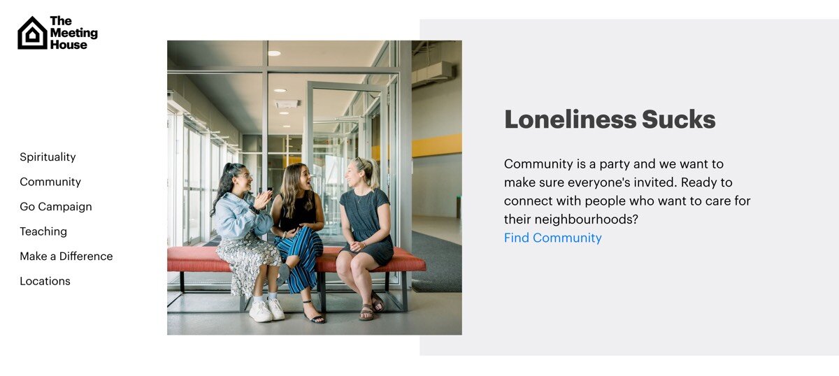
The Meeting House Loneliness Sucks Message.
5. Make your pages skimmable.
Website visitors are busy these days. As much a we’d love to have their full attention, we just don’t. It’s important to make your website pages as scannable as possibleThe Village Church. The best way is to use larger headlines and space that break up paragraphs and sections so readers can skim on the go.
Folks at The Village Church like to write! Their website is packed with information, but they do a great job using bold headlines to break up the content into readable sections.
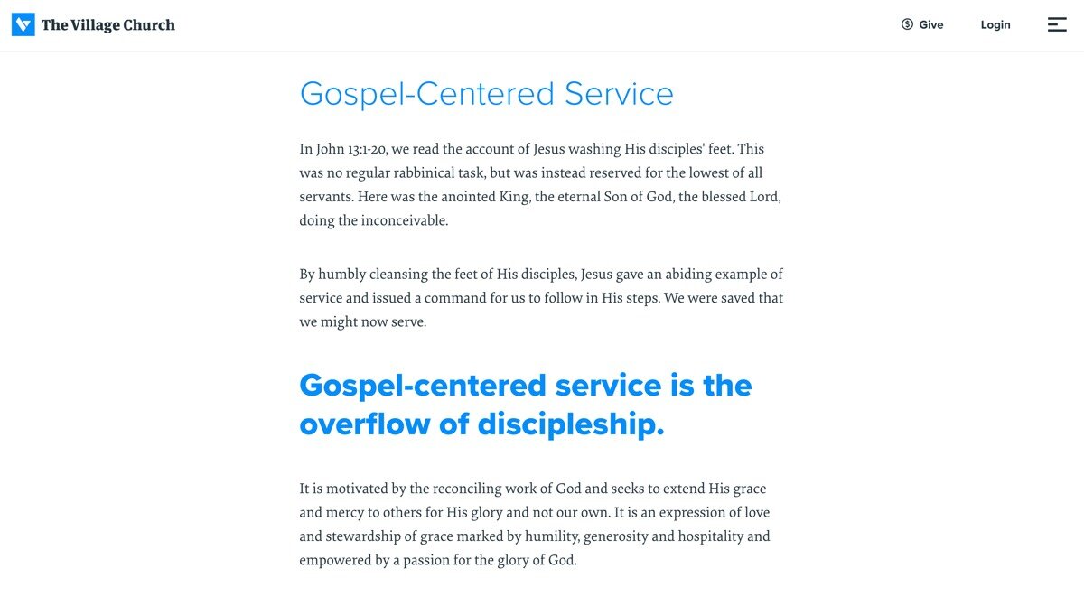
The Village Church Mission Page.
6. Make your fonts count.
Speaking of headlines, the fonts you use can have a major impact on the look and feel of your website. In fact, the right fonts can stand completely on their own as a strong design element. But don’t go crazy! Keep your website limited to 1 or 2 standalone fonts.
The Village Church uses a thin,-styled font, called Proxima Nova to create a modern and fresh look.

The Village Church Homepage With Proxima Nova Font.
The Summit Church uses a fun, casual font, called Alegreya to create a friendly and welcoming website.

The Summit Church Mission Page.
7. Keep a consistent color scheme.
No matter your style, you can carry your church’s brand color through your entire site to create a polished look. Wether your colors are bold or soft, let them stand out and lead the show!
Good News Church uses a vibrant color scheme throughout their entire website which creates a fun and happy vibe that’s hard for anyone to deny!
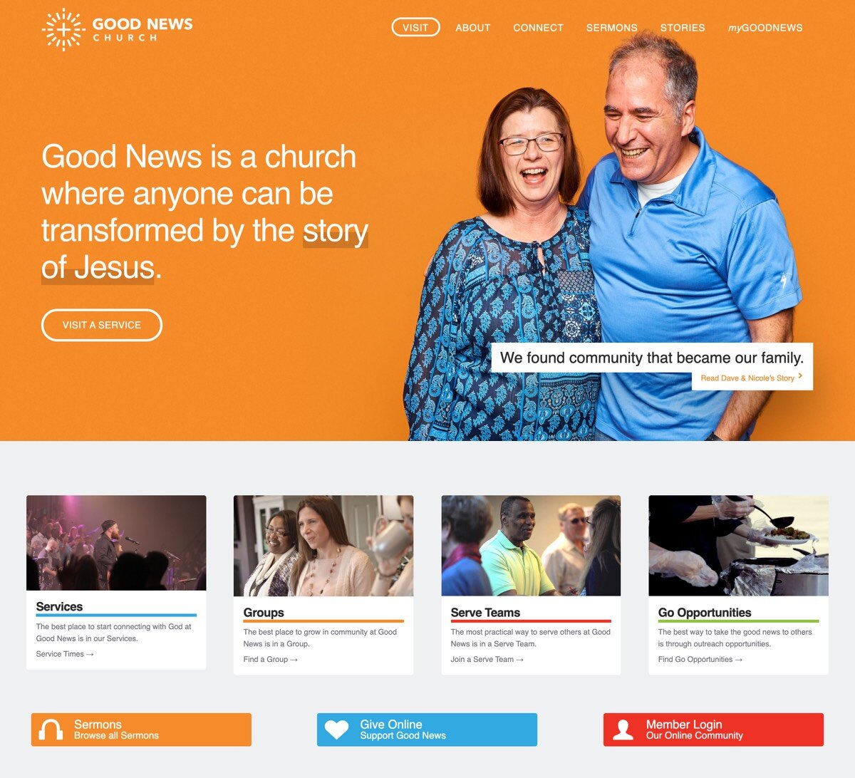
Good News Church Homepage.
The Church at Rocky Peak uses a soft, earthy tone to create a casual and light-hearted feel.
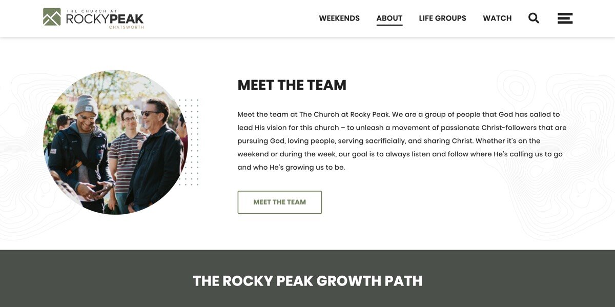
The Church at Rocky Peak About Page.
8. Let great images do the talking.
Images have a strong way of expressing what words can’t say. Use real-life images when you can to show your community doing what they do best! Keep your image color tones and filters similar throughout your site to create a complete and cohesion look.
The Father’s House Orange County uses a simple image grid to guide visitors to new sections. It’s a fun and inviting way to guide visitors through your site.
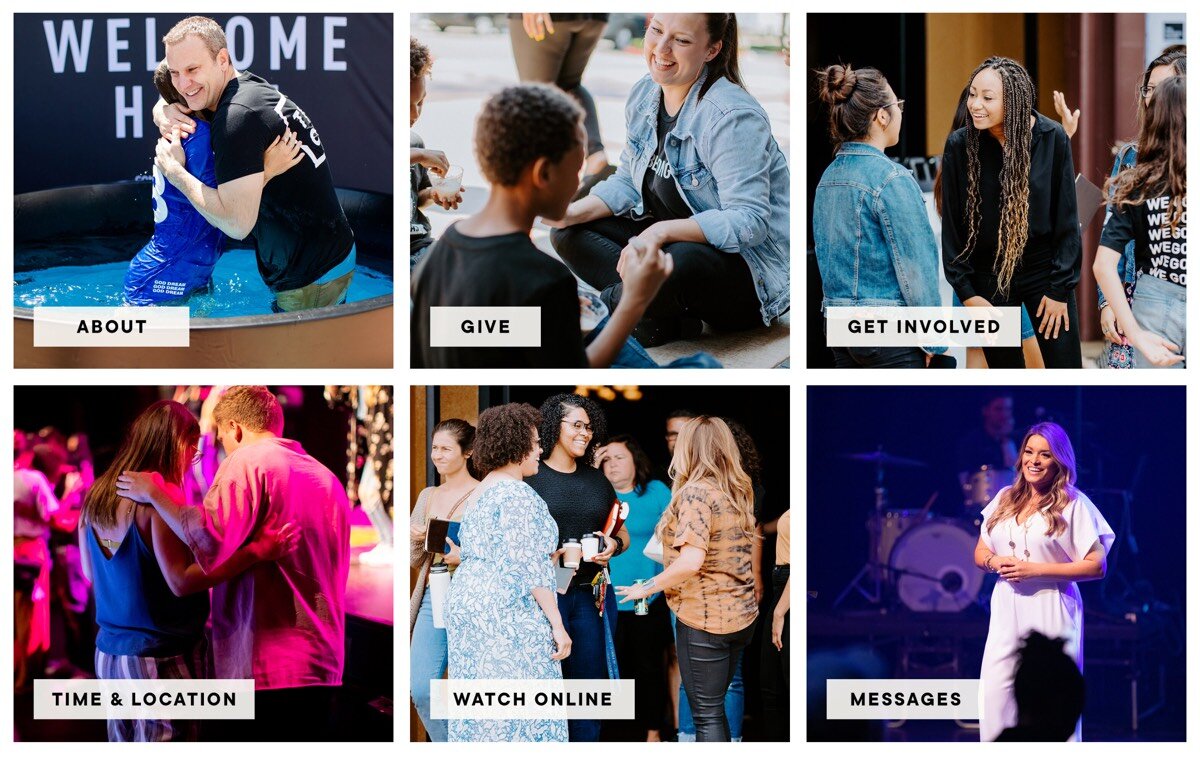
The Father’s House Orange County Image Grid.
The Church at Rocky Peak helps visitors find life groups by using real-life photography of people in their community enjoying life together.
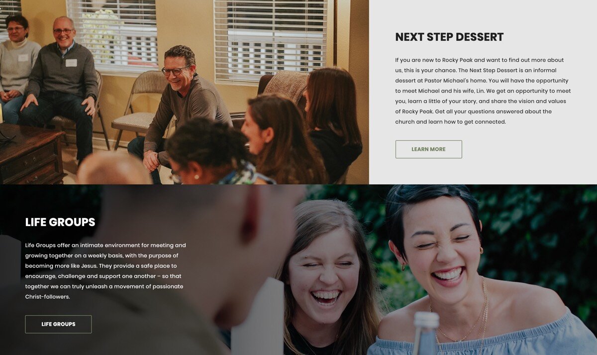
The Church at Rocky Peak Life Groups Seciton.
9. Remove all the clutter.
The biggest enemy to your church website is clutter. And Clutter = Distractions. Keep pages simple and light. If an element doesn’t support the goal of your page, get rid of it ;)
Bridgetown Church has a spacious and distraction-free homepage making it easy for visitors to find what they are looking for.
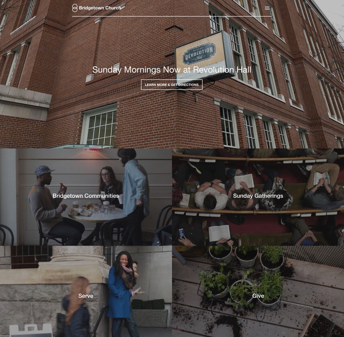
Bridgetown Church Homepage.
10. Add a “junk drawer”.
Simplifying you website takes some serious work. Just because something doesn’t belong in your navigation or on your homepage, doesn’t mean you have to completely forget about it. A great solution is to create an organized footer menu so website visitors have full access to all of your site’s content. As Don Miller, author of Story Brand, suggests, every website needs a “junk drawer.”
City Hope Church moves several page links to the “junk drawer” to keep the main areas of their website simple and focused.
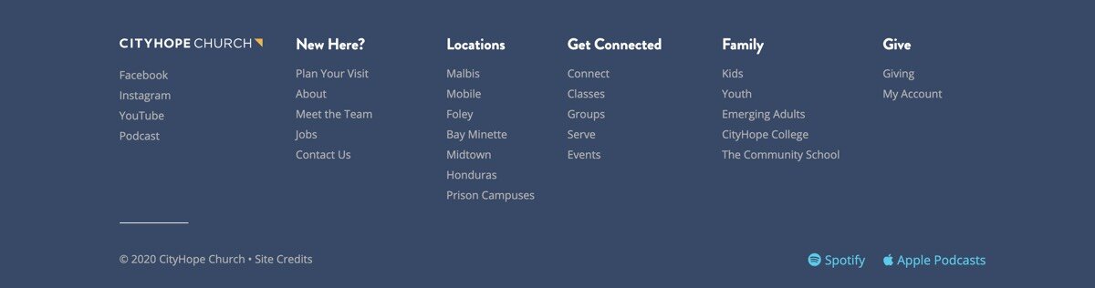
City Hope Footer Navigation.
What’s next?
Of course there’s lots of ways to improve your church website, but these 10 design tips are made to help you streamline your website and connect with more people online. Now is your time to build your dream website. You got this!
Do you have a tip that’s worked well for your ministry? Let us know below so we can check it out!